Moving Forward / Castelli 2021
We are very excited to be riding in Castelli gear starting in 2020 and through 2021. After many years with our prior kit manufacturer, we thought this switch was a great opportunity to update our current kit design. This is the story of how our latest, and we think greatest, kit design was developed…
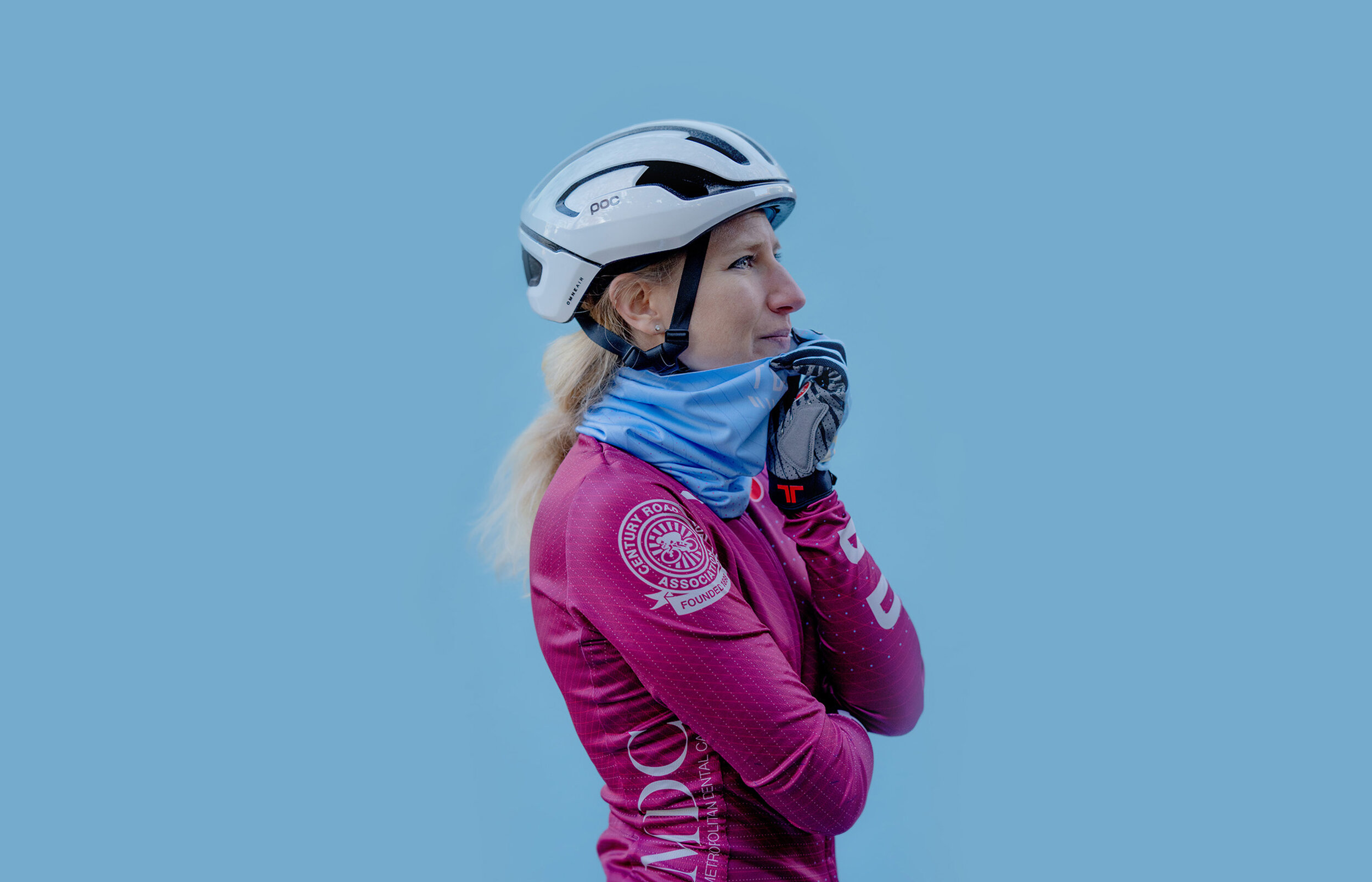
New kits by Castelli. New helmets by POC Sports.
This was the second major redesign that I have managed for To Be Determined. When I first inherited the kit designs from what was then known as Team Health Warrior, I felt the time was right for an update. I started with turning the colored stripes into parallelogram blocks which brought dynamism to the traditional stripe idea. We introduced a new color, maroon, that took a prominent part of the kits with a ⅓ maroon ⅔ navy ratio. Transitioning fully into the maroon as brand color was established with the following year’s designs as we simplified the jerseys and switched to only maroon (also not forget the cream accessories.)
This year we are keeping the maroon top and as another big step of cleaning the overall design we stripped our parallelogram blocks of colors since the shape is already recognizable amongst the peloton and since became our icon.

In the world of cycling we are always chasing “marginal gains” by utilizing a wide variety of tactics, one of which includes wrapping ourselves in lycra. I wanted to bring in textures to create warmth to these extremely technical Castelli garments. The subtle pattern I created mimics knit stitches in vector format and reflects a modern interpretation of the traditional textures. The pattern is continuous throughout the whole kit, even the accessories. The transitions between garments is seamless. For example, the pattern successfully blends from arm warmers to the sleeves as a continuous pattern.

The pattern transitions seamlessly between pieces.
The final design is fairly unexpected. A large TBD logo on the sleeves and gloves make sure that they are iconic and legible from all the angles. From far away, it doesn’t look different from the previous design except the larger solid color logos. However, the real surprise reveals itself when you get closer to the rider and start appreciating the details.
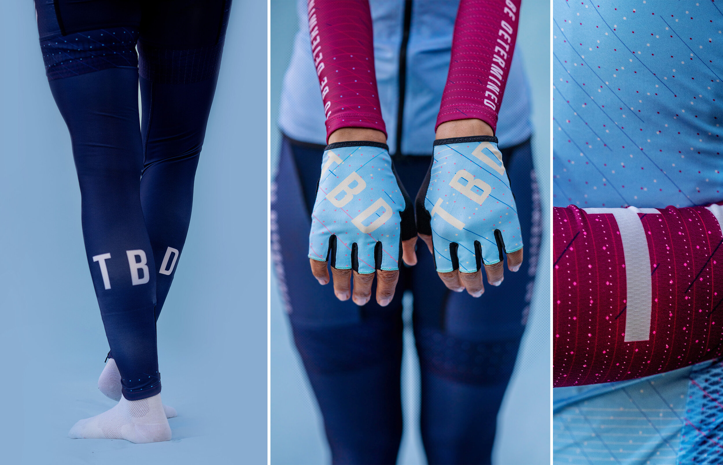
Logo placement on various Castelli pieces
I loved the cream vest from the previous generation, but it’s always good to look forward and change things up. This year we are switching to a “feel-good” tone of blue that accents the colors that we already use. It’s not too vibrant, and it’s not too pastel. By incorporating vintage and modern color palettes as well as the textures the kit successfully bridges the two aesthetics. It is funny to look back and see the color combination I picked here matches the colors of a Turkish soccer team jersey I used to hate growing up. I never understood why anyone would combine maroon with blue. I thought it was crude, but now I understand.

Maroon / Light Blue combo was definitely my least favorite growing up.

Pattern on pattern.
The new TBD kit is a technical piece of equipment from Castelli that is influenced by vintage aesthetics. We can’t wait for the day we can go out and racing in them.
